
-
Dolphin Web SolutionEcommerce7 Product Page Best Practices Every eCommerce Store Should Follow
 15 Min
7 Product Page Best Practices Every eCommerce Store Should Follow


Table of Contents
 Show
Show

Summary :
Your product page is where customers decide whether to buy or not. Even small mistakes can lead to missed sales. This blog covers seven best practices to improve your product pages, including using high-quality images, clear descriptions, adding reviews, and optimizing speed. These changes can turn your visitors into customers.
In eCommerce, what is the one thing that decides whether someone buys from your store or walks away? Your product page.
In today’s competitive market, it is not enough to have a great product. You need a page that clearly shows it, builds trust quickly, and makes buying feel effortless.
In a physical store, customers can touch, feel, and compare before making a decision. Online, they rely entirely on your photos, descriptions, and page layout. That is why your product page plays such a critical role — it is where most buying decisions are made (or lost).
Yet, many online stores still overlook their product page and leave with poor-quality images and confusing layouts, which leads to lost sales and higher bounce rates.
In fact, studies show that 98% of shoppers choose not to buy when product information is missing or inaccurate.
These simple mistakes kill sales every day, and many store owners are unaware of them.
The good news? It can be fixed.
In this blog, we will walk you through 7 product page best practices that every eCommerce store should follow to create smoother, more trustworthy shopping experiences and boost conversions along the way.
7 Product Page Best Practices Every eCommerce Store Should Follow
Here are seven product page best practices that every eCommerce store should follow:
1. Use High-Quality Product Images and Videos
When customers land on your product page, the first thing they notice is the image.
If your product photos are dull, blurry, or fail to properly showcase the product, most people will not scroll any further; they will leave immediately.
A study reveals that 75% of online shoppers primarily rely on product photos to inform their purchasing decisions.
Therefore, you should invest in large, clear images that showcase your product from multiple angles. These photos are not just visual; they answer questions buyers did not even know they had.
Moreover, you can showcase short videos of your product, such as a 30-second demo that shows how the product works, fits, or feels in motion, which can instantly boost confidence.
2. Write Clear, Benefit-Focused Product Descriptions
Your product description is not just text — it is your pitch. And if it does not quickly explain why the product is worth buying, most people will scroll right past it.
87% of online shoppers say that product content is “significant” when deciding to buy.
So, instead of stuffing your description with specs and features, you should focus on showing benefits.
Also, use bullet points for scannable highlights, but ensure that your main paragraph addresses the key buyer questions, i.e., What is it? Why should I buy it? How does it help me?
A clear, benefit-first description is not just about conversion. It also reduces returns and customer complaints.
3. Optimize Product Page for Mobile Devices
Did you know? Over 75% of all eCommerce traffic worldwide comes from mobile devices.
So, if your product page is not easy to use on a phone, you are losing a considerable amount of sales without even knowing it.
Optimizing for mobile is not just about shrinking your desktop design. You need to rethink the entire experience:
- Layout: Keep it clean and scrollable. Place your product image, title, price, and “Add to Cart” button near the top. So users do not have to hunt around for the basics.
- Text size & buttons: Make sure fonts are large enough to read without zooming and buttons are thumb-friendly and easy to tap without frustration.
- Load time: Compress images, lazy-load videos, and cut down on scripts that slow things down—every second matters.
- Avoid clutter: Do not overwhelm small screens with too many elements. Focus on clarity, not decoration.
It’s recommended to hire from top eCommerce development companies and let the professional help you optimize your store.
4. Add Social Proof – Ratings, Reviews, and UGC
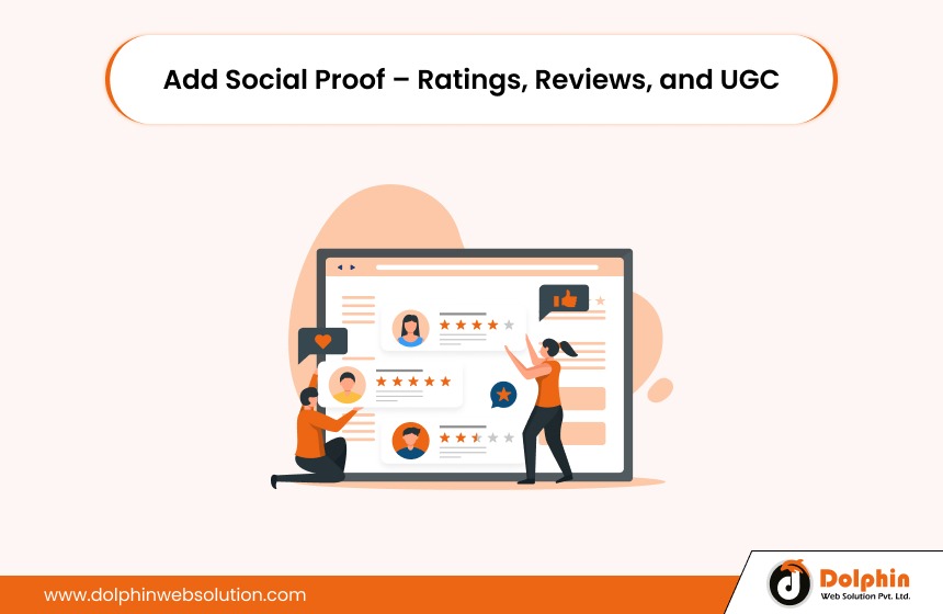
Online shoppers solely rely on other customer’s opinions to make their buying decisions.
In fact, according to recent statistics, 99% of consumers read reviews before making a buying decision. This clearly shows other customers’ reviews and how they matter to them.
Smart sellers know how to use and take advantage of their business. Here is what you can do:
- Enable customer reviews on every product page. Even if they are short, they demonstrate that real people are making purchases.
- Display star ratings prominently near the product title or price — this helps users easily spot social proof without needing to scroll.
- Feature helpful or top-rated reviews at the top of the section. Do not bury the good stuff.
- Show real-time signals, like “1,200 sold in the past month” or “Just restocked due to high demand.”
- Allow customers to upload their photos or videos.
5. Create a Clear Call-to-Action (CTA)
Your product page should never leave a shopper asking, “What do I do next?”
Your CTA is the button that tells customers what to do next. Usually something like ‘Add to Cart’ or ‘Buy Now’.
It may seem like a small detail. But it plays a massive role in helping people complete their purchases.
Here is how to get it right:
- Make it easy to see: The button should be big enough and placed near the top of the page. People should not have to scroll or search to find it.
- Use clear words: Say exactly what will happen when they click. Good examples include: Add to Cart, Buy Now and Get Yours.
- Choose a standout color: Your button should be a different color from the rest of the page. So it catches attention right away.
- Ensure it works on mobile: The button should be easy to tap on a mobile device. If it is too small or too close to other buttons, people will get frustrated.
- Avoid distractions: Do not surround the button with excessive links, pop-ups, or banners.
Think of your CTA as the handshake that seals the deal. Make it confident, direct and easy to click.
6. Display Key Info Upfront (Price, Stock, Shipping)
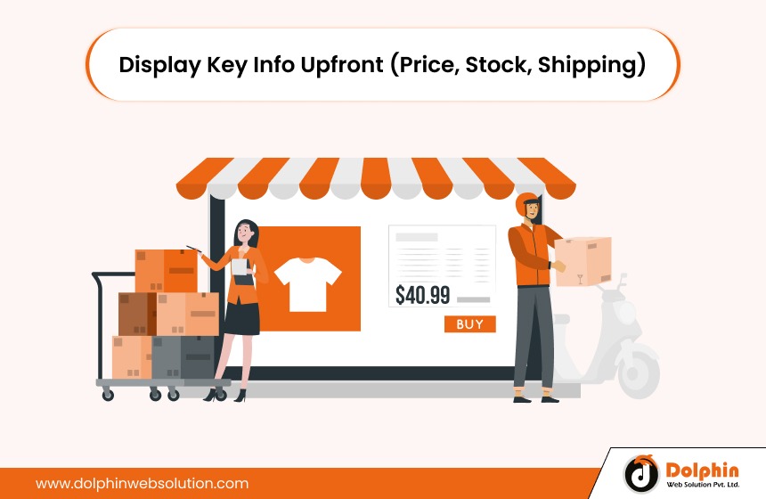
When shoppers land on your product page, they are looking for answers — fast.
- How much does it cost?
- Is it available right now?
- When will it arrive?
- Can I return it?
If they cannot find this information within a few seconds, they will bounce — even if they love the product.
That is why you should place all key details near the top of the page, close to the product title and the “Add to Cart” button.
Here is what should be visible:
- Price: Show the full price, discounts, and savings upfront. If there is an offer or sale, make it noticeable.
- Stock Status: Inform customers about the availability of the item, including whether it is in stock, low, or back-ordered. This also helps create urgency when numbers are low (e.g., “Only three left!”).
- Shipping info: Mention estimated delivery time, free shipping offers, or store pickup options. People love fast and clear delivery timelines.
- Return policy: Even a simple “Free 10-day returns” adds confidence.
When everything they need is right in front of them, they are far more likely to trust your store and complete the purchase.
7. Improve Page Speed and SEO Elements
A beautiful product page would not be of much help if it loads slowly or never appears in search results.
To keep things fast:
- Compress all images (do not sacrifice quality, but reduce size)
- Use lazy loading for videos and product galleries
- Cut out unnecessary pop-ups or heavy scripts
- Choose a lightweight, mobile-optimized theme
- And do not forget SEO optimization in your eCommerce store.
Make sure each product page has the following:
- A clear, keyword-rich title and meta-description
- A clean, descriptive URL
- Alt text on all images so Google understands them
- Product schema markup (to help your product show rich results like star ratings and price — right in search)
When your product page loads quickly and ranks well, you provide a smoother, more trustworthy experience that leads to sales.
Conclusion
Your product page is where buying decisions happen and even small changes can lead to big results.
To increase your eCommerce sales, ensure that your product page has clear images and videos, readable descriptions that highlight benefits rather than features, a mobile-friendly design, abundance of reviews, an obviously viewable “Add to Cart” button, prominent display of key information (i.e., pricing and shipping), quick loading speed and basic SEO optimizatio
Take a few minutes to review your own product pages. Are they doing all seven? If not, now’s the perfect time to start improving.
Need help making it happen? Our Magento experts can help you optimize every part of your product page — from design to performance. Contact us today!

Rohit Prajapati


Rohit Prajapati is the Chief Executive Officer of Dolphin Web Solution and a recognized expert in eCommerce technologies, digital commerce strategy, and product development. With over 15 years of experience in the technology industry, he helps businesses build high-performing online stores, scalable digital platforms, and innovative customer experiences. As a certified Adobe Commerce Business Practitioner (Magento Solution Specialist), Rohit possesses deep expertise in Shopify, Magento, Shopware, Hyvä, and enterprise eCommerce ecosystems. He has successfully consulted businesses worldwide on platform selection, digital transformation, migration strategies, and growth-focused commerce solutions. Rohit regularly shares insights on eCommerce trends, AI-driven commerce, online business growth, and emerging technologies. His mission is to help organizations create future-ready digital experiences that drive measurable business outcomes and long-term success.

We can help you with
- Dedicated Team
- Setup Extended Team
- Product Development
- Custom App Development
Our Offices

AHMEDABAD (INDIA)
B- 203-206, Empire Business Hub, Science City Road, Sola, Ahmedabad – 380060

BERLIN (GERMANY)
Badensche Str. 28, 10715 Berlin, Germany

CALIFORNIA (USA)
9601 Reseda Blvd, Apt#223, Northridge CA-91324, USA

ALBERTA (CANADA)
302 Skyview Ranch Drive NE, Calgary, Alberta, Canada T3N0P5





Hello!
Click one of our contacts below to chat on WhatsApp