---
title: "How To Change Responsive Breakpoint and Viewport in Magento 2"
url: "https://dolphinwebsolution.com/change-breakpoint-and-viewport-in-magento-2"
date: "2021-07-13T16:35:09+05:30"
modified: "2023-08-24T09:39:19+05:30"
author:
name: "Jayesh Makwana"
categories:
- "Magento"
word_count: 648
reading_time: "4 min read"
summary: "In this article, we will change the media breakpoint and viewport in Magento 2. Breakpoints are used in stylesheets to set up the screen width at which the design changes, for example, from the mob..."
description: "In this article, we will change the media breakpoint and viewport in Magento 2. Breakpoints are used in stylesheets to set up the screen width at which the d..."
keywords: "Viewport in Magento 2, Magento"
language: "en"
schema_type: "Article"
related_posts:
- title: "Top 10 Reasons to Why You Should Choose Magento for eCommerce"
url: "https://dolphinwebsolution.com/magento-for-ecommerce-top-10-reasons-as-to-why-you-should-choose-it"
- title: "How to Add Custom Tab in Product Page Magento 2"
url: "https://dolphinwebsolution.com/how-to-add-custom-tab-in-product-page-magento-2"
- title: "How to Get System Configurations All CMS Pages In Magento 2"
url: "https://dolphinwebsolution.com/how-to-get-system-configurations-all-cms-pages-in-magento-2-2"
---
# How To Change Responsive Breakpoint and Viewport in Magento 2
_Published: July 13, 2021_
_Author: Jayesh Makwana_

In this article, we will change the media breakpoint and viewport in Magento 2. Breakpoints are used in stylesheets to set up the screen width at which the design changes, for example, from the mobile to the desktop version sometimes in many websites display custom views for mobile and tablet.
### Follow the below steps to know how to Change breakpoint and viewport in Magento 2.
#### **Step 1:** First of all, you need to create a custom theme
- Please follow our another article [How to create a custom theme](https://dolphinwebsolution.com/how-to-create-a-custom-theme-in-magento-2)
**Step 2:** create **view.xml** at **app/design/frontend/Dolphin/custom\_theme/etc/** and paste the below code.
```
1024px
dots
```
Here, we change the default fotorama gallery responsive breakpoint. it will manage the Gallery thumbnail and dots as per the new breakpoint.
#### Step 3**: create **requirejs-config.js
create**requirejs-config.js** at **app/design/frontend/Dolphin/custom\_theme/** and paste the below code :
```
var config = {
config: {
mixins: {
'mage/menu': {
'Magento_Theme/js/menu-media-breakpoint-mixin': true
}
}
}
};
```
#### Step 4:** create **menu-media-breakpoint-mixin.js
create**menu-media-breakpoint-mixin.js** at **app/design/frontend/Dolphin/custom\_theme/Magento\_Theme/web/js/** and paste the below code :
```
define([], function () {
'use strict';
return function (widget) {
widget.menu.prototype.options.mediaBreakpoint = '(max-width: 1024px)';
return widget;
};
});
```
Here, we change the default menu responsive mobile toggle navigation. It will display the [toggle menu](https://magento.stackexchange.com/questions/206274/move-the-action-nav-toggle-block-into-the-header-panel-on-magento-2) as per the new breakpoint.
#### Step 5:** create **default\_head\_blocks.xml
create**default\_head\_blocks.xml** at **app/design/frontend/Dolphin/custom\_theme/Magento\_Theme/layout/** and paste the below code :
```
```
By default, media queries are outputting styles in two different files:
1. **styles-m.less** – which generates basic and mobile-specific styles
2. **styles-l.less** – generates desktop-specific styles (for 1025px width screen and higher)
If you want not to load **styles-l.css** in mobile then use the above code.
#### Step 6:** create **\_responsive.less
create**\_responsive.less** at **app/design/frontend/Dolphin/custom\_theme/web/css/source/lib/variables** and paste the below code :
```
// /**
// * Created By: Dolphin Web Solution Pvt. Ltd.
// Responsive variables
// */
@use-flex: true; // Use flexbox [true|false]
@responsive: true; // Theme is responsive [true|false]
@screen__xxs: 320px;
@screen__xs: 480px;
@screen__s: 640px;
@screen__custom: 767px; // (Add custom @screen__custom);
@screen__m: 1025px; // (Change @screen__m 768px to 1025px)
@screen__l: 1280px;
@screen__xl: 1920px;
```
Here, we changed the Breakpoint of **@screen\_\_m** 768px to 1025px it will change the design as per the new breakpoint and also add the new custom breakpoint **@screen\_\_custom**.
#### **Step 7:** Just run below Magento commands
```
php bin/magento s:up
php bin/magento s:s:d -f
php bin/magento c:c
```
**Now, Just Check your change breakpoint**
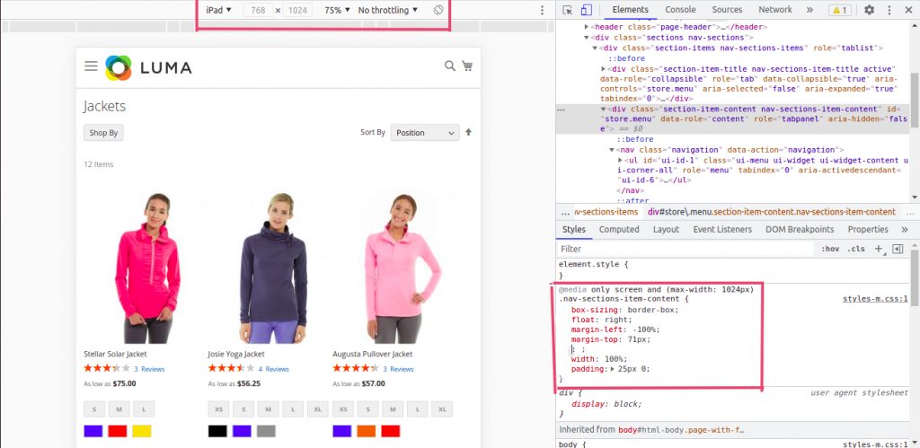
**That’s it!**
I hope this technical blog will help you to find what you were looking for.
That’s all, If you have any further questions about Magento 2 theme development or if need any help from our [Magento 2 expert](https://dolphinwebsolution.com/hire-magento-2-developers/), contact us now for a free consultation.
**Bookmark** it for your future reference. Do comment below if you have any other questions.
**P.S.** Do share this note with your team.
---
_View the original post at: [https://dolphinwebsolution.com/change-breakpoint-and-viewport-in-magento-2](https://dolphinwebsolution.com/change-breakpoint-and-viewport-in-magento-2)_
_Served as markdown by [Third Audience](https://github.com/third-audience) v3.5.3_
_Generated: 2026-08-26 06:54:45 UTC_